Logo for the University of British Columbia's Department of Asian Studies
ロゴデザイン 「UBCアジア研究学部」
—CLIENT—
The University of British Columbia, Asian Studies, CANADA.
—CREDITS—
Julien Butterlin
—ROLE—
Graphic Design
The University of British Columbia is located in Vancouver, Canada and is one of Canada’s largest research universities. UBC is ranked in the top 40 best universities and among the top 20 best public universities worldwide. The Department of Asian Studies is one of the leading Asian studies departments in North America and offers diverse courses in the languages, literature, and cultures of China, Japan, Korea, and various south Asian countries.
Designing a visual identity for an entity housing such diversified fields of study poses the immediate problem of finding a common denominator among disparate cultures. In addition to this difficulty, Asia is visually well represented worldwide and many of its common symbols have become clichés, such as bamboo or kanji (Chinese ideograms.) During the initial meet up with the faculty team, I suggested working with Chinese or Japanese traditional heraldry, an idea that was well received. One of the faculty members also suggested she would like the logo to be a flower. The idea of using a flower was interesting given Vancouver’s unique geographical situation: a coastal seaport famous for its surrounding nature. Vancouver also has one of the largest urban parks in North America. The city council is well known for its engagement towards sustainability and has passed numerous acts to make Vancouver the most sustainable city in the world by 2020. The area is also well known as a center for outdoor sports, which are enjoyed by many UBC students.
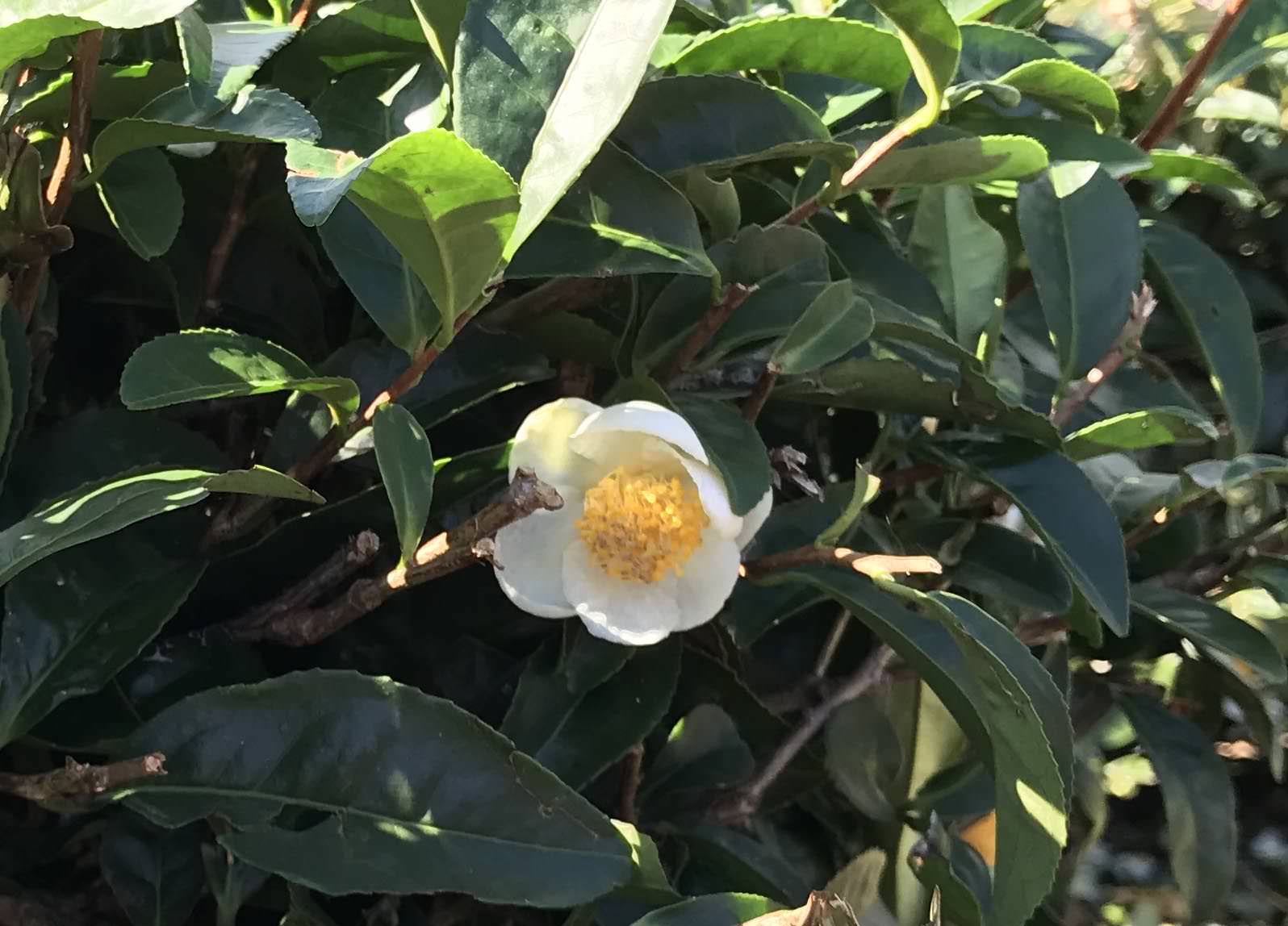
The design problem then became one of finding a flower that was representative of Asia at large. While flowers are ubiquitously represented across many Asian countries, they are usually tied to particular cultures or countries such as the cherry blossom, sakura, a national symbol of Japan or the lotus flower with its symbolization of purity, non-attachment and enlightenment in Buddhist tradition. After examining a few possible candidates, I decided to try using the tea flower, Camellia sinensis or Thea sinensis, the tea plant whence many teas are derived. Tea is the second-most widely consumed beverage in the world after water, and has played and continues to play a central role in all Asian cultures. The tea flower symbol seemed a good, natural choice to symbolize the diverse Asian languages, literature, cultures, histories, and religions represented in the Department of Asian Studies. It also had the advantage of being less known, and thus not overused, compared to other Asian symbols.
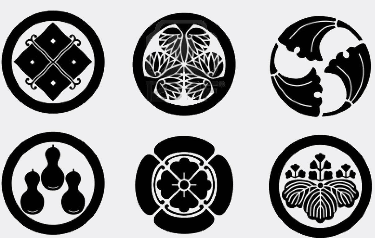
In terms of graphical rendering, I stayed attached to the original idea of using heraldry, for its ties to local histories and logo-like characteristics. The visual convention used for the Asian Studies logo is that of Japanese crests, mon (also called kamon or monsho): emblems used to identify individuals, families or, more recently, regions, governmental bodies or even businesses. Mon are very well represented among Japanese visuals. Most of these symbols are designed as a circular shape containing an element identifying the entity it represents–in this case, the tea flower. For consistency with UBC’s design communication, the colors used in the logo are the official UBC colors, gold and blue.